01 — Context
From API Calls to a Self-Serve Platform
Magnite's DV+ is a sell-side advertising platform (SSP) for publishers — helping them monetize inventory across display, video, native, audio, and digital out-of-home (DOOH) formats. The Curator Marketplace extends this further, allowing third-party marketplace operators to build curated deals: packaging publisher inventory with their own targeting, pricing, and audience data, then making those deals available to DSPs and buyers.
Before this project, configuring a curated deal required direct API access or manual intervention by Magnite's internal teams. There was no UI. Third-party operators — buyers, publishers, DSPs, creative agencies, sales houses, audience data companies — had to work through workarounds that didn't scale. Multiple operators had explicitly asked for a self-serve interface. This project was the answer.
Live
Shipped to Production
Who Are Marketplace Operators?
The primary users of Curator Deals Management are third-party marketplace operators — entities permitted to build and manage curated deals on publisher inventory. This spans a diverse set of business types: buyers, publishers, DSPs, creative agencies, sales houses, and audience data companies. Their technical sophistication varies, but they share a common need: to configure deals independently, without requiring Magnite to intervene on their behalf.
A secondary persona is internal Magnite users, who have access to additional administrative capabilities — including creating deals for Magnite-owned marketplaces and managing curator assignments.
02 — Problem
A Complex Configuration Surface with No Good Precedent
Designing the deal creation flow meant resolving several competing tensions from the start. A deal involves a significant number of configurable parameters: marketplace selection, deal naming, DSP and buyer assignment, publisher targeting, inventory formats, pricing strategy, scheduling, and an advanced targeting tree that can span geography, DMP segments, and nested audience logic.
Three core tensions shaped the design problem:
Tension 01
Single-page vs. stepped wizard. Users wanted to see all form fields in one view rather than stepping through them — going back and forth between wizard steps felt unnatural for a form this complex. This was compounded by conditional fields that depend on inputs in other sections, which are hard to communicate clearly when split across separate steps.
Tension 02
Complexity vs. clarity in targeting. Advanced targeting trees can become deeply nested — AND groups containing OR subgroups across multiple DMP and geography conditions. Showing all of this inline risked making the form feel unmanageable, but hiding it risked errors.
Tension 03
Static form vs. live feedback. Operators need to understand the estimated reach impact of their publisher and targeting selections before submitting — but running a query every time a field changes would be disruptive and slow.
Participants in early sessions explicitly said they wanted to see the whole form at once. Navigating back and forth through steps — especially to fix something that affected a later field — was the main frustration with stepper-style flows.
— User research finding, early discovery sessions
Three Pricing Strategies, One Form
Adding to the complexity: operators can choose from multiple pricing strategies when configuring a deal, each with different implications for how the pricing fields behave and what validation is required. The UI had to present these options clearly enough that operators could select the right one without misunderstanding the downstream financial implications — while also enforcing system-level pricing constraints without exposing internal fee logic.
03 — Design Decisions
Four Choices That Defined the Form
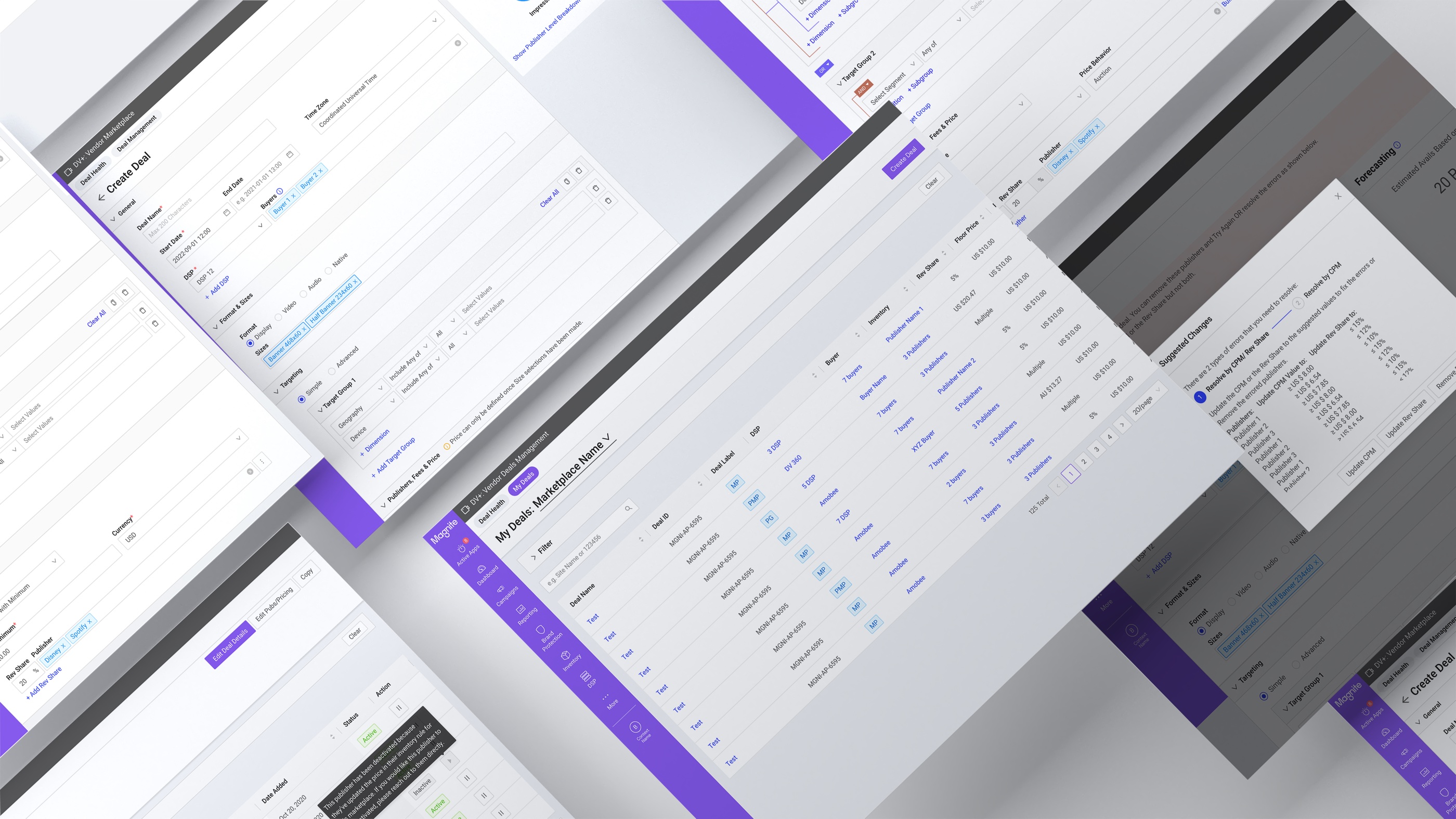
1. Single-Page Form Over a Stepped Wizard
The research finding was clear: users wanted to see the entire form in one view. A stepper would have fragmented the configuration across multiple screens — making it hard to understand the full scope of a deal, and harder still to navigate back when something earlier needed to change.
The more significant problem with a stepper was cross-section dependencies: some fields in the form conditionally enable or disable based on inputs made elsewhere. When those relationships span steps, users lose the visual connection between cause and effect. A single scrollable page keeps dependent fields visible and in context — the relationship between an input and what it unlocks is immediate rather than something the user has to hold in memory while moving through steps.
Collapsible sections — General, Format & Sizes, Targeting — kept the page manageable without hiding required fields behind pagination. Each section could be independently expanded or collapsed without affecting the rest of the form state.
The Create Deal form: collapsible sections on the left with Simple / Advanced targeting toggle, and the persistent Forecasting panel fixed to the right. Both Simple and Advanced targeting modes are accessible from the same page.
2. Persistent Forecasting Sidebar
The Forecasting panel was a product requirement — it shows a 7-day estimated summary of impressions, uniques, and viewability based on the operator's current publisher selection. The design decision was where to put it.
I placed it in a fixed right-side panel rather than inline below the targeting section. The reason: the forecasting numbers update as operators interact with the publisher selection — not just the targeting fields. Keeping it in a persistent sidebar meant the estimates were always in view regardless of which section the operator was working in or how far they'd scrolled. An inline placement would have buried it during General or Format setup, defeating the purpose of live feedback.
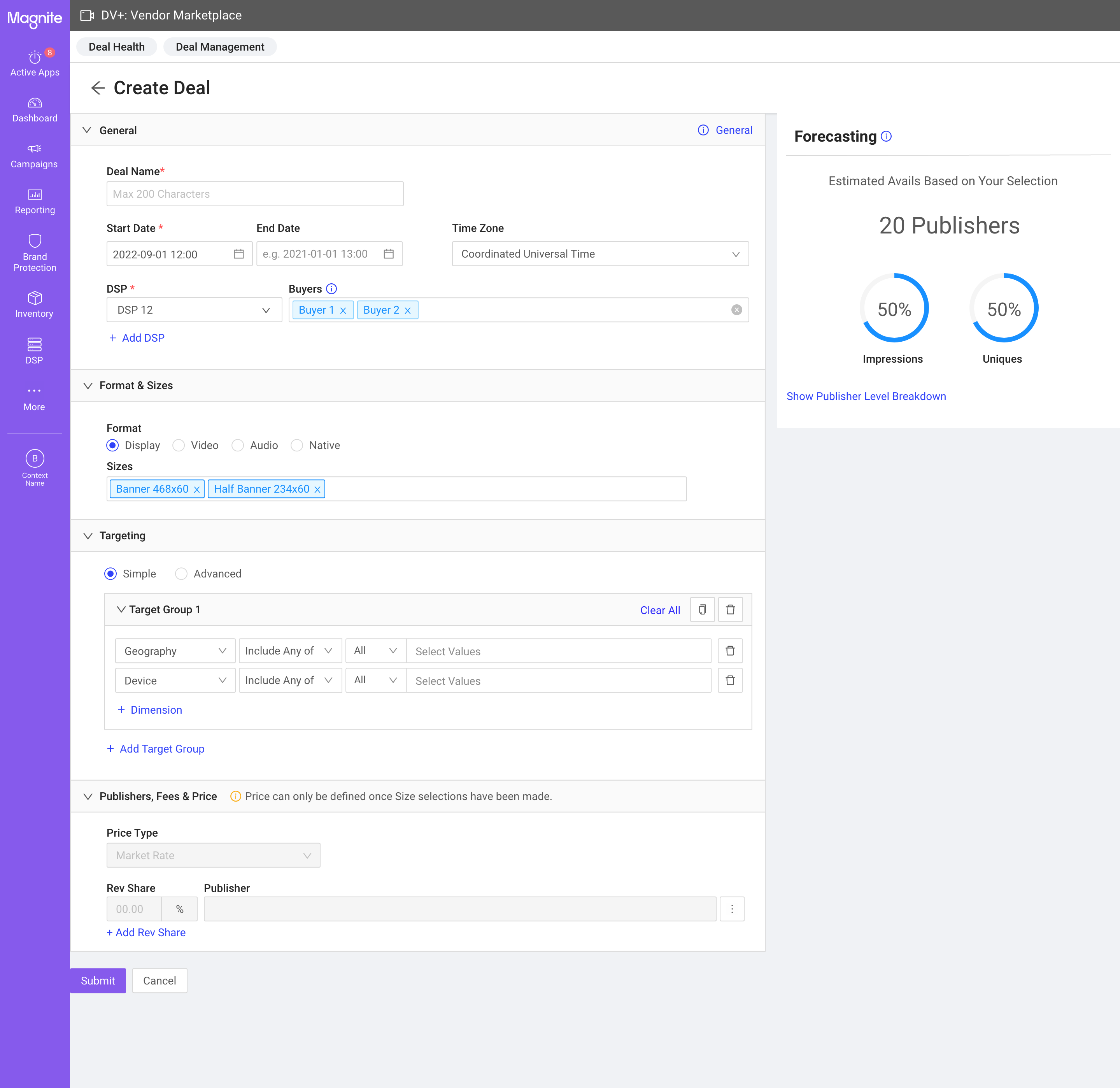
3. Two-Mode Targeting: Simple and Advanced
Targeting complexity varies significantly across operator types. To accommodate both straightforward deals and complex multi-condition setups, the form offers a Simple mode and an Advanced mode — toggled from the same section without leaving the page.
Advanced targeting uses an AND/OR logic tree that can nest geography, DMP segment conditions, and audience logic across multiple groups. We already had an established component pattern for this, but user testing showed operators losing track of which conditions belonged to which group when trees became complex. I refined the visual hierarchy — indentation, border styling, and badge placement on AND/OR nodes — to make the group structure scannable at a glance without reading every condition.
Deal Details — the targeting tree with nested AND/OR logic. The refined visual treatment uses indentation depth and border styling to clarify which conditions belong to which group, reducing the cognitive load of parsing complex multi-level targeting.
4. Lifecycle-First Design: Edit, Copy, Validate
Deal creation was only part of the problem. Operators also needed to manage deals after launch — editing pricing without disrupting targeting, cloning successful deals for rapid scaling, and resolving validation errors (such as publisher pricing floor conflicts) without abandoning the deal entirely.
Editing was split into two distinct modes: one for deal details (general settings, formats, targeting) and one for publishers and pricing (CPM, revenue share, publisher additions/removals). This separation prevented a common mistake — inadvertently changing pricing while intending to update targeting — and made each edit surface more focused. The copy flow pre-populated all fields from the original deal, enabling operators to spin up variations quickly.
04 — Iteration
Three Cycles, Each Closing a Different Set of Gaps
Cycle 1 — Core Launch (2022)
The first version established the foundational deal creation and management flows: Deal Health, Deal Listing, Create Deal, Deal Details. The single-page form and persistent forecasting panel were validated by early users. PM Kelsey Davey worked closely through this cycle — from initial mocks to launch — and the product was well received, particularly by operators who had been waiting for a self-serve alternative to the API workflow.
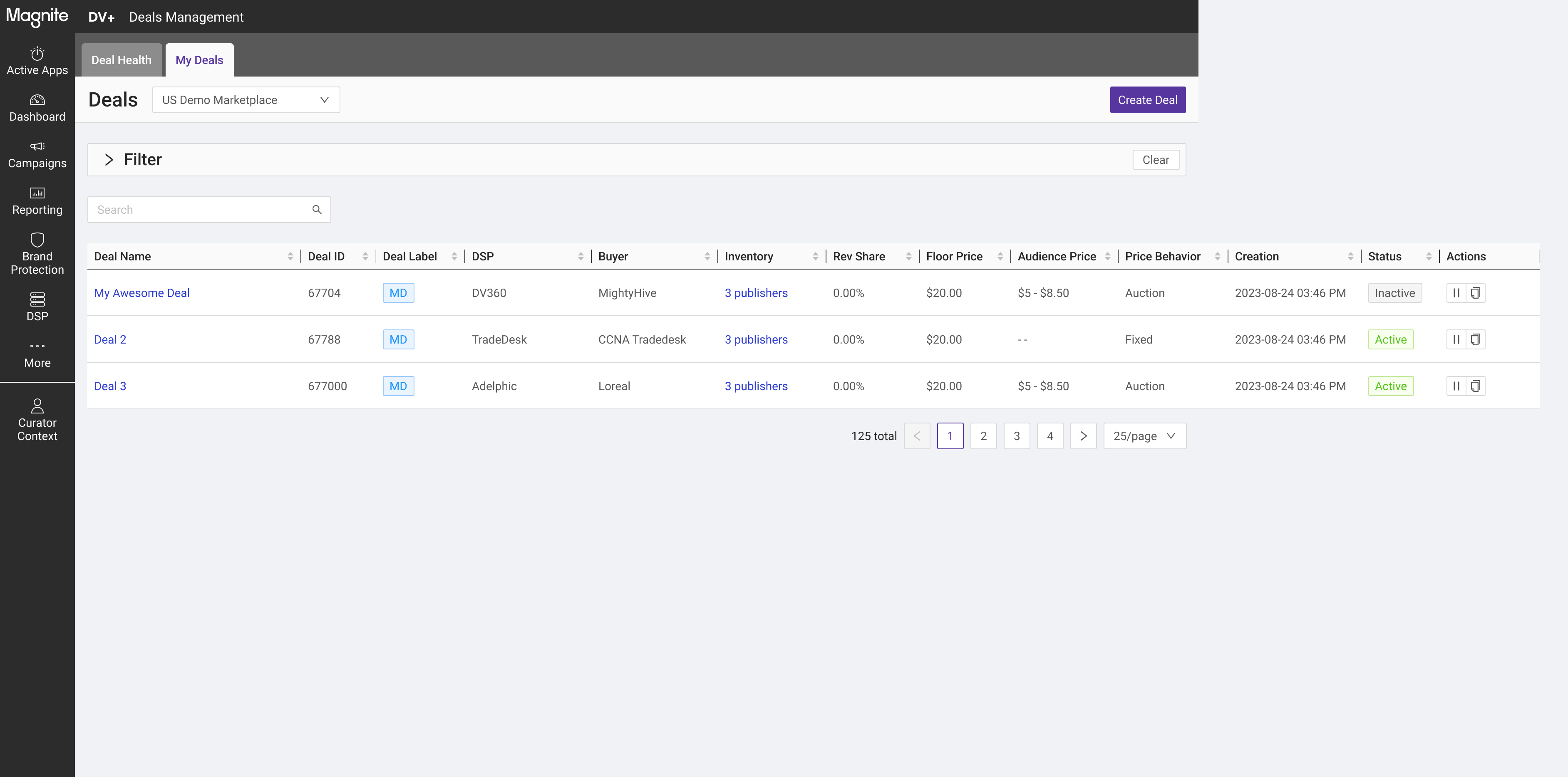
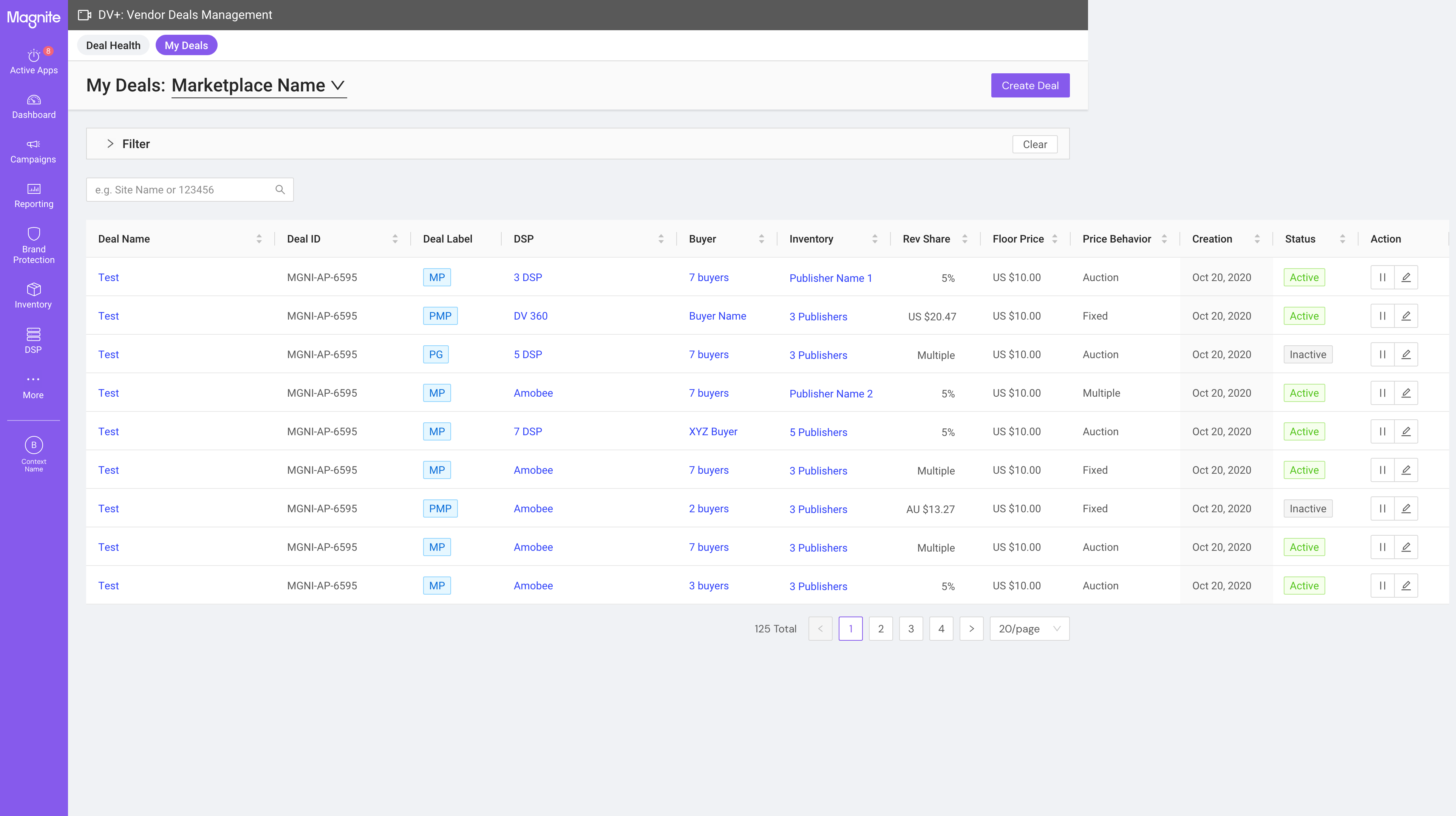
The Deal Listing view: a filterable table showing all deals across marketplace, deal label (MP/PMP/PG), DSP/buyer attribution, pricing behavior, and inline status controls. 125 total deals shown across paginated results.
Cycle 2 — Review and Refinement (2023–2024)
A second round of user research uncovered gaps in the product. Several of these were already on the roadmap — the research confirmed that the prioritization was correct rather than revealing surprises. This cycle used design annotations to surface specific interaction questions (like action button ordering and edit entry points) for structured team review before implementation.
The second user study confirmed what we already knew — it wasn't a surprise, it was validation that our roadmap was correctly prioritized.
— Reflection on the iteration process
Cycle 2 — annotated for team review
Cycle 3 — shipped version
The annotated iteration version vs. the refined shipped version of the Deal Listing. Action column order and inline edit affordances were updated based on the review cycle.
Cycle 3 — Platform Expansion (2024)
Following the core launch, Marketplace Management and bulk upload capabilities were added to the surface. This expanded Curator Deals Management from a deal creation tool into a broader marketplace operations platform. The Deal Details view was refined with clearer section hierarchy and updated action placements to support the new administrative workflows brought in from Cycle 3 features.
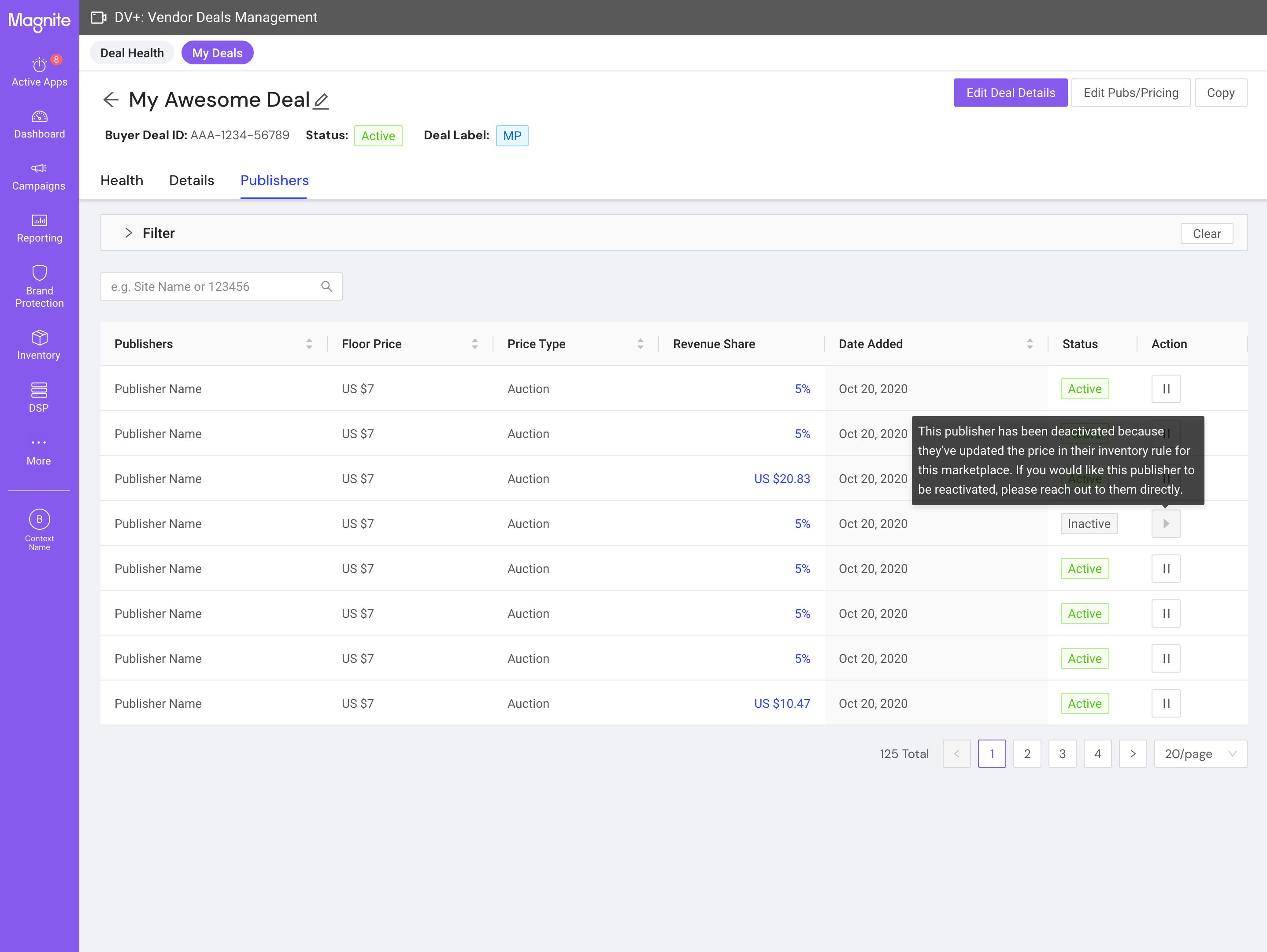
The refined Deal Details view — tabbed navigation across Health, Details, and Publishers; collapsible targeting section; updated Edit Deal Details and Edit Pubs & Pricing action buttons that were separated to reduce accidental edits across the two surfaces.
05 — Outcome
Shipped, Adopted, and Grown
Curator Deals Management shipped to production and is live today. The platform replaced a manual, API-dependent workflow with a self-serve UI that third-party marketplace operators can use directly — without Magnite's involvement in each deal configuration. The DV+ Marketplace overall contributed to a 114% increase in ad spend, with the deal creation surface at the core of that growth.
API → UI
Workflow Replaced
3+
Features Added Post-Launch
Post-launch iterations added Marketplace Management, bulk upload, and expanded administrative capabilities — features that extended the original scope without requiring structural changes to the creation flow. This validated the architecture: the single-page form was flexible enough to absorb new functionality without a redesign.
Learning 01
Research that confirms the roadmap is still valuable — it's evidence that prioritization is correct, not a signal that the team missed something. Framing it this way to stakeholders shifted the conversation from "what went wrong" to "what comes next."
Learning 02
Persistent UI elements earn their real estate when their information actively changes with user behavior. The forecasting sidebar isn't decoration — it's a live feedback loop that changes with every publisher selection. That distinction drove the placement decision.
Learning 03
Designing for non-linear workflows requires early thinking about draft state and partial saves. The investment in single-page form architecture paid back across every subsequent feature addition — because the flexibility was built in from the start.