-
Guide:
Prof. Madhav Tankha
-
Team
Mayank Gupta, Vonetta R DeVonish, Nico Lopez, Mingqi Rui
-
Tools:
Adobe XD, Adobe Illustrator, Adobe Photoshop
-
Project timeline:
15 weeks, Spring 2021
Design Jedi
Design Jedi is a job hunting and preparation hub for UX Designers, that takes various aspects of job hunt and puts them into one single tool in a coherent and comprehensive manner.
With this product we wanted to address the needs of the design community at large and specifically entry level UX Designer who are overwhelmed by the job-hunting process and are trying to make it into the industry.
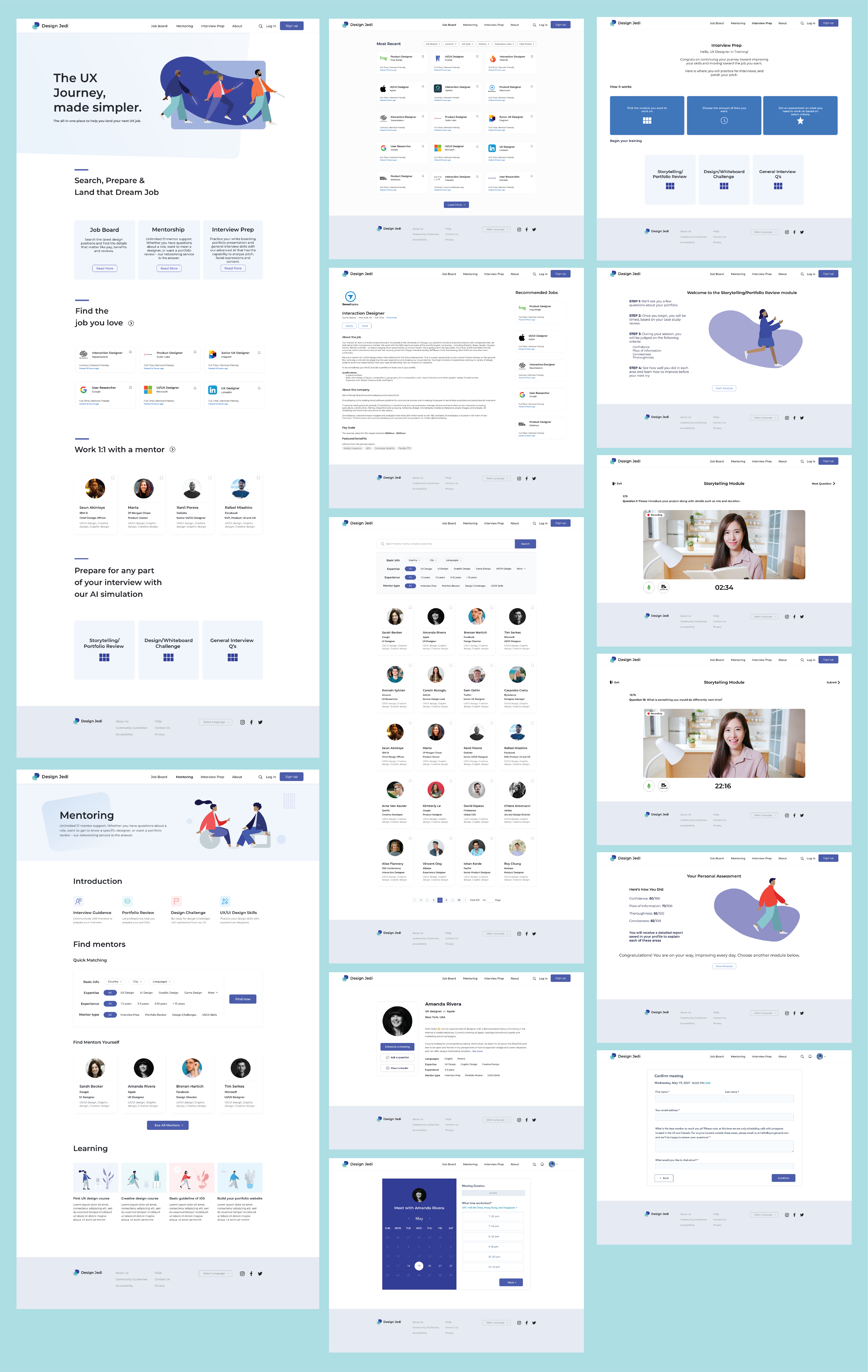
Final DesignsConflicting Resources
Being entry level designers ourselves we felt a lack of resources for design students to prepare for their interviews and design challenges. Also, it difficult to find the right jobs within the swarm of thousands of different job boards out there. We asked ourselves the following question.
Where do UX designers go to find out about jobs, presentation skills, design challenges, and the other miscellaneous things they need in order to prepare for an interview?
Consolidated Job Board and Interview Preparation Guide
Design Jedi acts as a one stop solution for everything you need to score your dream job. It consolidates UX specific jobs from thousands of jobs boards out there into one single website. It harnesses the power of AI to analyze your story telling and interview skills. In addition, it has a mentoring feature that allows you to connect to industry professionals and make meaningful relationships.
UX Researcher
Conducted 3 remote interviews with prospective users to gather insights and created the persona template. Designed the user journey template to better understand the target audience’s needs.
Conducted 2 remote usability test with the high-fidelity mockups to gather user insights and further iterate the designs.
UX Designer
Designed the low fidelity wireframes for the job’s boards section. Defined the style guide to transform low fidelity wireframes into high fidelity designs and prototyped the website interactions.
Research + Design + Test + Iterate
We combined the qualitative data from the 9 remote interviews to gain a deeper understanding of user needs and their current process. This helped us broaden our perspective to cater to a larger demographic and further elaborate our product features in accordance with user needs.
After the preliminary research we brainstormed some initial wireframes, followed by a style guide. Finally, we designed the high-fidelity prototype and further conducted 5 more user tests.
Students & Entry Level Designers
We focused on current UX Design students and recent graduates from a school or bootcamp. We wanted to address the problems we faced are students ourselves and focusing on this user group gave a deeper insight about the process they currently use to apply for jobs and interview preparation. Based on this preliminary feedback we tweaked our product features to cater a larger subset of designers.
Observation Study
In order to better understand the user needs and concerns we conducted user interviews and observation study sessions to get ourselves acquainted with the current job-hunting process of our target audience. We spoke to 9 participants, who were either current UX Design students or recent graduates from a school or bootcamp. We invited people to participate in our study through LinkedIn and Slack channels.
Innovative Methodology
Our participants have implemented a variety of ways to tackle their job hunt. They are very meticulous and pore through job listings, set alerts, and follow their favorite companies on LinkedIn. They talk to people in the industry, making new connections. And they are thriving in this remote environment which has removed some of the anxiety they face when interviewing and presenting their work.
Needs to be Addressed
There were several things about the job hunt that our participants wished to address:
- Staying engaged during the interview and coming across as interested and upbeat
- Making portfolio better geared toward what they want to pursue in UX design
- Practicing verbal and written communication skills
- Improving UI design skills
- Enhancing storytelling skills during presentations and in case studies
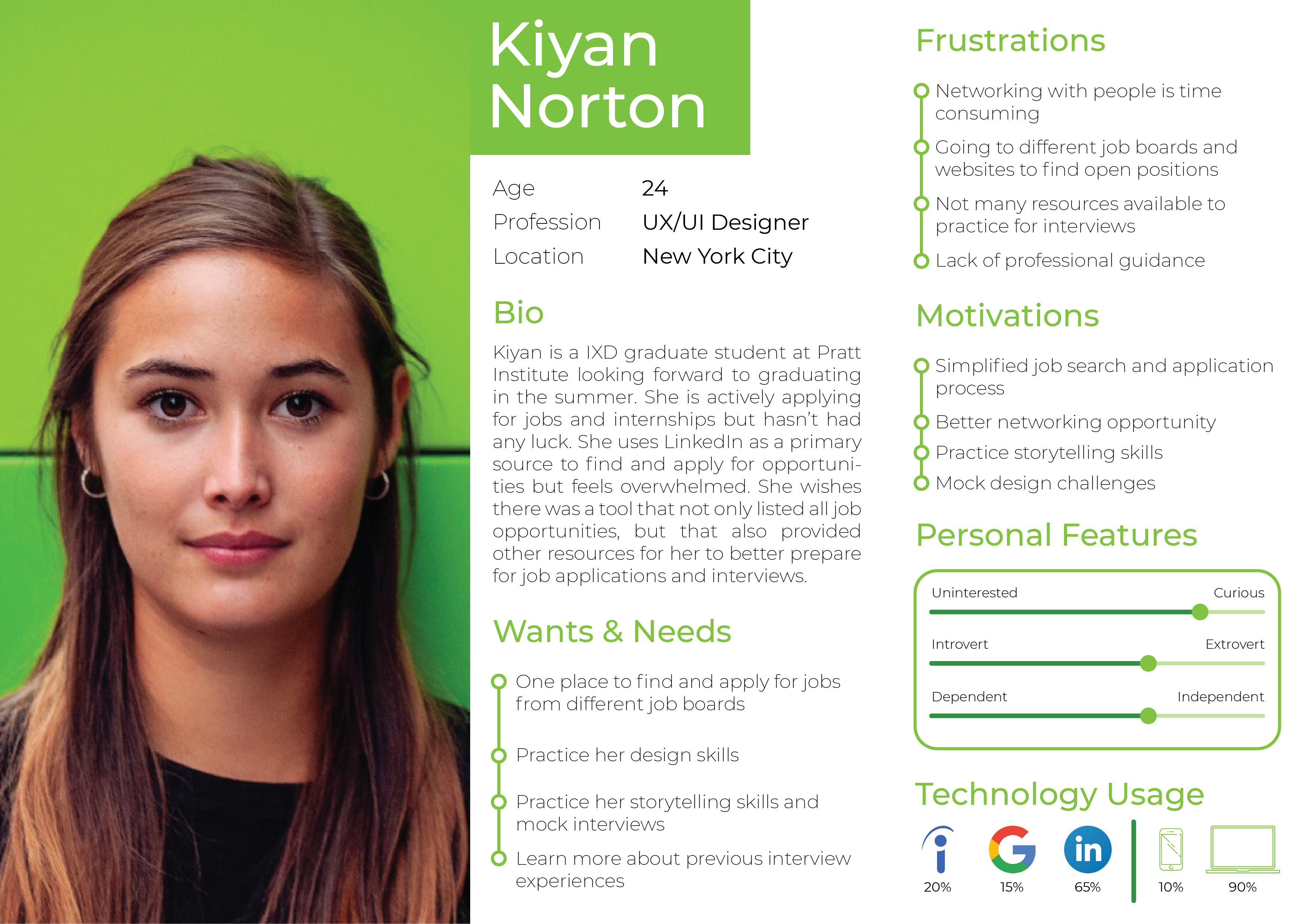
User Persona
Based on the insights from the user research, I created the persona for the target user group of our product - current student
User Journey Map
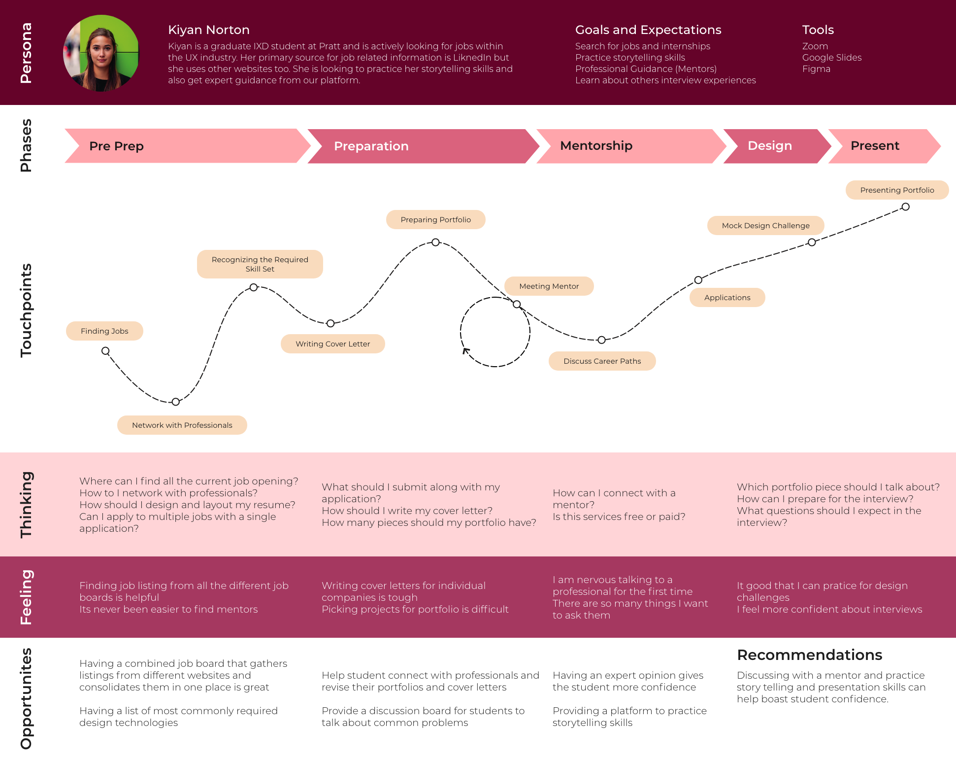
In order to clearly identify the user needs and goals we created a user journey map. This further helped us define the key features for our product.
Comparative Analysis
To understand how our product compared to the existing products used by the target audience we conducted a comparative analysis research. We compared Design Jedi with LinkedIn and Glassdoor based on 4 parameters as highlighted in the table below.
| Target User | Creativity | Design | Information Architecture | |
|---|---|---|---|---|
| LinkedIn |
Professionals from a plethora of fields looking for jobs and networking opportunities | Relevant, creative, and clearly addresses the problem. | Visuals form a consistent, clear, systemized design that speaks to target audience. | Well defined information architecture with obvious call to action buttons and clear path to reach goals. User can easily complete tasks. |
| Glassdoor |
Professionals looking for jobs and getting to know more about a company, like salary, common interview questions, etc. | Practical and is relevant to the problem, but not creative. Concept is strong and is helpful to the user but meets typical expectations. | Visuals form a clear system of grids, typography, color, and design principles, but may not speak to the target audience | Mostly intuitive, guidance is needed on interactions. Flow meets expectations but does not exceed user needs. User can complete tasks but with difficulty. |
| Design Jedi |
Entry level Designers with some experience and recent grads. | Concept is innovative, powerful, thoughtful, and straightforward. | Visuals form a consistent, clear, systemized design that speaks to target audience. Form follows function with a strong and meaningful system of grids, typography, color, and design principles. | Intuitive and easily used without guidance. The flow is instinctual and there is a clear path to complete tasks or reach a goal. |
Interviewing
Design Jedi gives the user a platform to practice and improve their storytelling skills using automated recordings and gives them tips on how to improve their case studies and portfolios. It is the only platform that lets user prepare for interviews, by using video indexers and a set of previously asked questions from a particular company.
Networking
Design Jedi serves as a one-stop solution for users to connect and build relationships with professionals. It also helps users understand how to maintain those relationships, find mentors and provides links to more specific Slack channels and design communities.
Job Hunting
Job search can be overwhelming and difficult. There are thousands of different job boards out there with thousands of postings for different fields. Design Jedi is not a conventional job board like LinkedIn, it is dedicated to the design community. It aggregates specific design jobs from all the different job boards into one single product.
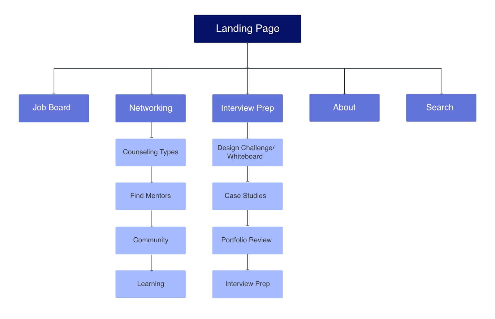
Paper Prototype
In order to brainstorm and verify our ideas we made some paper prototypes. Every team member was responsible for sketching one feature according to the user flow. I designed and laid out the Job Board feature in addition to this I also helped in creating reusable components which were used by the team across their designs.
In order to confirm my design hypothesis I ran a quick user test with one user.
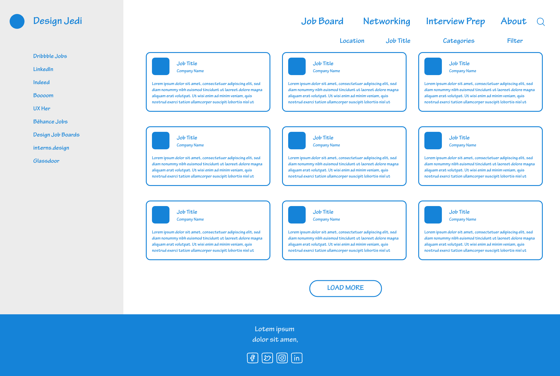
Final Wireframes
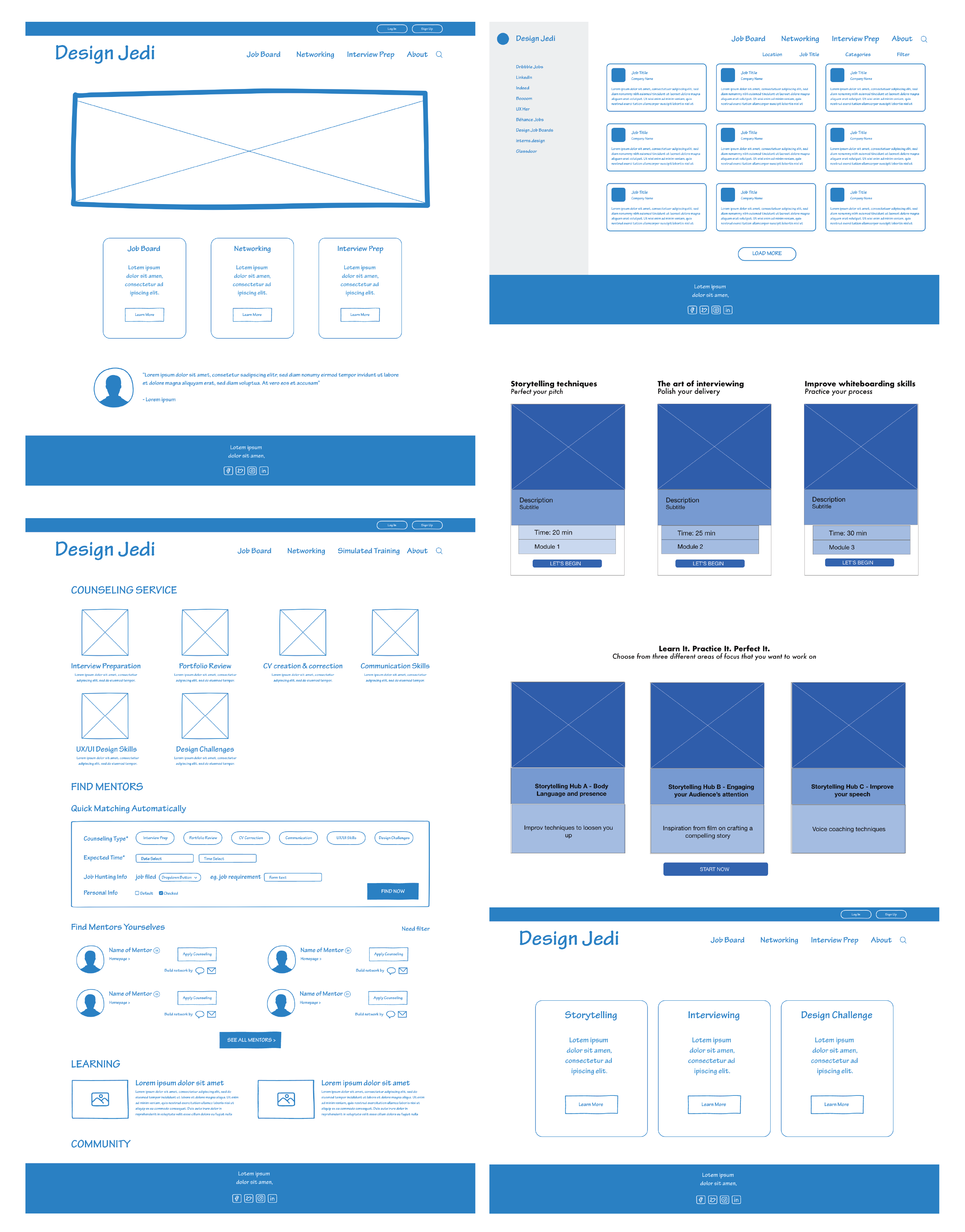
Consistently Convenient
After an extensive research, a few iterations and a million end-moment tweak we finally came up with the high-fidelity designs. We ran 5 final user testing sessions with the high-fidelity prototype and adjusted the design according to user feedback. Although the design wasn't completely ready we got some valuable feedback.
