-
Guide:
Prof. Chris Alen Sula
-
Team
Mayank Gupta
-
Tools:
Carto, Open Refine, Microsoft Excel
-
Project timeline:
6 weeks, Fall 2020
Prediciting Future COVID Outbreaks
The COVID-19 pandemic hit us in December 2019 and rapidly spread around the globe. The role that data analysis and visualization has played during this outbreak is far from imaginable. Data analysis not only made it possible for us to fight this virus but also identify and save communities.
There are many efficient visualizations that help us understand the COVID data, but none of them used predicitive analysis to determine the future trends in COVID cases.
Final ReportFailure to show county population within visualizations
Almost all of the visualzations lacked one very useful feature of showing the county population. Using the entire county space can be a little misleading, as the poulation density of some counties is much less than the others.
Lack of using predictive analysis
None of the visualizations made use of Predicitve Analysis to show future trends in COVID cases. Spatial predicitve analysis can help identify trends and better allocate resources accordingly.
Using point size to show the county population
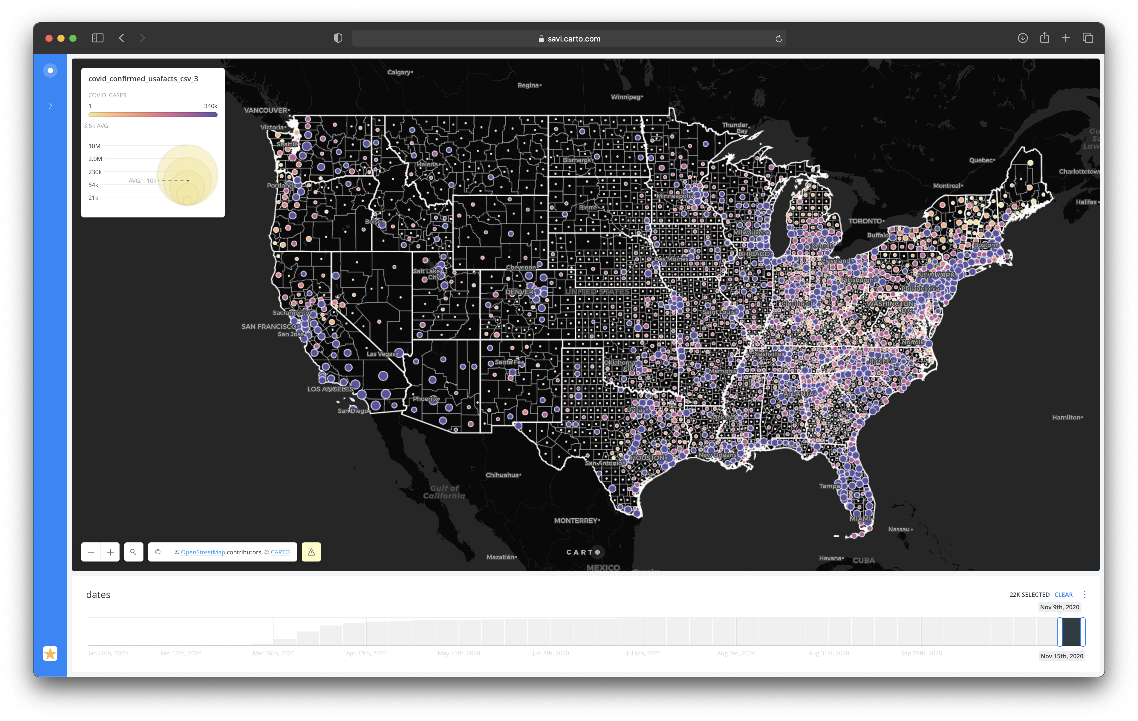
In order to resolve the issue of users confusing the size of the county with the population size, I used the point size variable to highlight the county population.
my role
I worked individually for this particular project. I started off by collecting all the required datasets and cleaning them in Open Refine. For some of the more complex datasets I had to use a combination of Open Refine and Carto in order to get the desired results. After completing the final visualizations I conducted a brief user study with 2 participants to better understand their needs while using these visualizations. I wanted the visuals to be simple so that they can be used by an array of users.
define+design+discover+dicuss

Data Cleaning
Initially the data for the total number of COVID cases was organized in separate columns, and the latitude and longitude columns were in a different table all together. Since the dataset with county latitudes and longitudes was in a zip format I had to do a little bit of extra work in order to merge the tables and get the desired final dataset.
- Import the county Latitude and Longitude dataset into Carto and download it as a CSV.
- Import the datasets in OpenRefine and import the latitude and longitude rows into the original dataset using the following function.
For adding Longitude row: cell.cross(“c_03mr20_1″,”fips”).cells[“lon”].value[0]
For adding Latitude row: cell.cross(“c_03mr20_1″,”fips”).cells[“lat”].value[0] - Perform Transpose operation to interchange the rows and columns, and export the Final Dataset.
Analysis
There are a lot of visualization out there to depict the COVID data, but their lack of highlighting the county population might result in inaccurate processing by the user. In order to tackle this problem I used the size variable to highlight the county population.
First visualizationThe first visualization I created aimed at highlighting the total number of COVID cases over time in every US county. I varied the point size of each county according to its population. Although I went back and forth while choosing the classification method for the point size, I finally settled for Jenks as it breaks the data into classes based on natural groupings inherent in the data. The final visualization has 5 data buckets and the size varies from 2 to 15. I also added a date widget which gives the user the flexibility to filter out and see only specific dates, in addition to this it also helps us analyze the propagation of the virus throughout the states.

The second visualization was aimed at conducting the predictive analysis on the US county COVID data, to determine which counties might act as the next hotspots. For running the Predictive Analysis I used the Predict Trends and Volatility (PTV) analysis tool built into Carto. PTV uses Spatial Markov Chains to calculate the trends and volatility. Since the system changes randomly, it is difficult to predict with certainty the next state of the Markov chain. However, the statistical probability of a systems future can be predicted.
The changes of states are called transitions, and the probabilities associated with various state-changes is called transition probabilities. The deviation of sum of these probabilities trending up (relative to the unit index of that probability) is given by trend_up, trending down by trend_down and overall trend (where sign signifies the direction negative for down and positive for up) by trend. Volatility is the degree of variation of the event series data over time, measured by the standard deviation of probabilities within the trends.

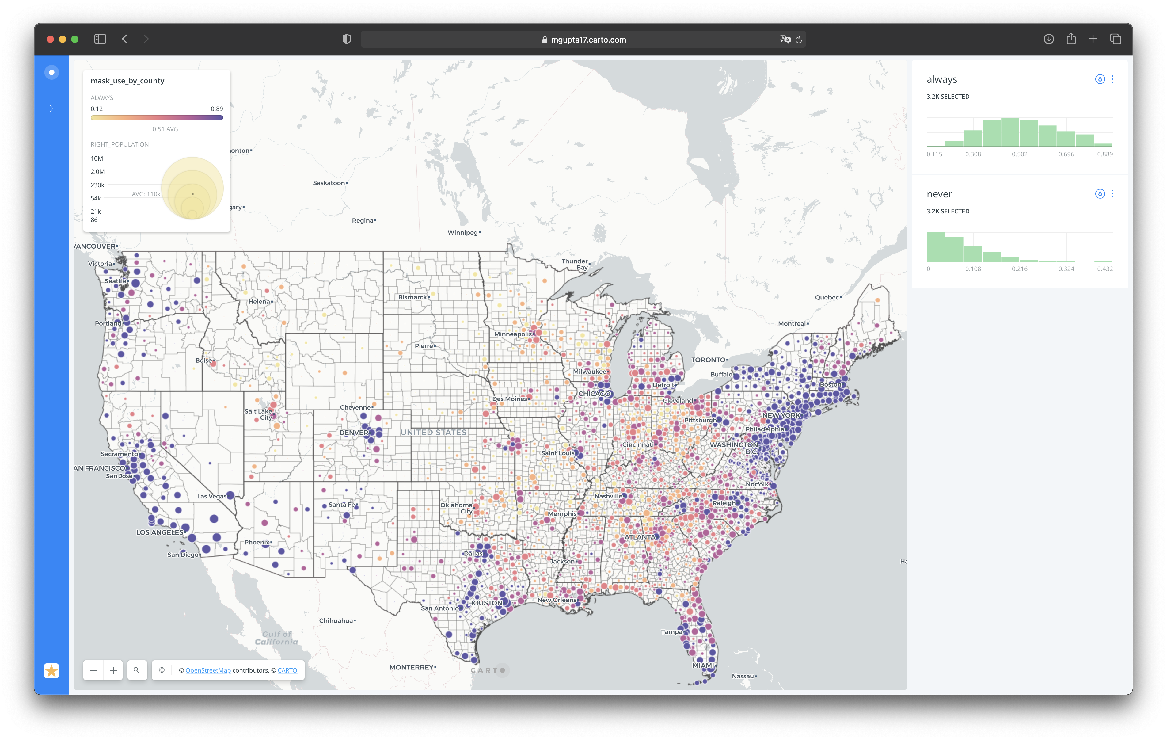
Through my third visualization is wanted to predict the number of cases based on the mask use data. So in order to do that I used the mask use dataset from New York Times, and based on this data I ran PTV analysis on my original dataset to see how the trend changes based on weather the county tends to use masks always or never. In order to facilitate user interaction with this visualization, I added the always and never widgets. These widgets let the user view weather a particular county is gonna trend up or down based on how they use the masks.

UX Study
In order to be able to cater to a larger audience, I wanted my visualization to be easy to interact with and comprehensible. I planned my user study with this idea in mind. I conducted my user study with a total of 2 participants, 1 out of the 2 participants had limited technological experience, but knew a lot about the COVID-19 pandemic. For this particular user study I figured that the think aloud method would work the best, as it would not only help me get a idea about how the user feels about the maps but also about the aesthetics like color and widget placements.
I started the process by defining the goals of the study and what I wanted to understand about my user behavior. The goals were as follows:
- Can the user interact with the visualizations without feeling lost?
- Is the purpose of the visualization and the widgets clear?
- Is the user able to use this visualization to determine the counties with higher risk of infections?
- Are the aesthetics of the visualization intriguing to the user?
After defining the goals of the study, I worked out a series of questions that would help me better understand the user needs and behavior. Initially I wanted to go ahead with the unguided review method, where the user has more freedom to interact with the visuals, but then I felt it might get to overwhelming for the users with limited technological experience and they might judge the visuals on the basis of ease of use. I defined the following tasks and questions for my user study.
- Can you identify what this visualization is all about? What are your initial thoughts after seeing these visualizations?
- Can you tell me the total number of COVID cases in New York City during the first week of September?
- What do you understand by the trend_up and trend_down values?
- What do you think about future COVID cases in New York City?
- Can you determine the counties where people “always” tend to use a mask?
Every question was followed up by two further questions.
- On a scale of 1-5 how well do you think you did on this task.
- Do you have any other questions or suggestions.
Throughout my user study I tried to be a passive viewer and not an active participant, because I believe that is the best way to understand a users point of view. One of the participants asked me what does “volatility” mean in the context of the map, to which I responded “what do you think it means”. This gave me a better understanding of what a potential user might think of the terminology.
Rationale
While I was researching for initial project I came across a plethora of visualization for COVID, and each one of them had a distinct feature. But interestingly enough I did not come any visualization that uses the power of predictive analysis to show the user what the future trends may look like. The other important feature that most of the visualizations fail to depict was the county population and how it correlates to the number of cases.
I believe when combined together all the final three spatial visualizations do a better job at explaining the user the cause and effect of COVID-19. I also think that looking at the mask use predictive analysis visualization more people are going to be motivated to wear masks which would help us further combat this deadly virus.
I used a consistently same color scheme across all the three visualizations. In a general setting this would be considered a bad idea as the same color defines different things in different visualizations, but since my visualizations are standalone and can be viewed and interpreted individually I thought it would be a good idea to use the same color scheme across the spectrum. The colors are color blind safe, and also subtle enough to not distract the user from data.
visualizations
Working together the maps deliver a much clearer picture of the COVID-19 pandemic. Based on the first visualization we can how it has spread across the US since the first case was detected. Looking at these trends we can also reflect on some of the steps that could have prevented it from getting this worse. The first look at the graph helps us conclude that the counties with higher population have higher rate of infection, but with exceptions in Maine and Vermont, where the rate of infection is quite low in spite of the large populations.
UX Study
While conducting the user study I was really glad that the users found it more helpful than any other COVID map they had previously used. One thing that all of the participants mentioned was the use of the point size to depict the county population, they thought it really helped them analyze the data much more effectively. Findings from the user study are noted below.
- Some of the points are too small and light and can not be seen against the light background.
- Clicking on the dates widget to filter a particular week, the following week is selected
- Users don’t understand the meaning of the terminology like volatility, trend_up and trend_down.
- It is harder to look for a particular county without the state borders
- The user had difficulty scrolling to the states of Alaska and Hawaii
Recommendations
based on user study
- Use a darker base map for the main COVID map, as it highlights the lighter and smaller county points as well.
- Add state borders to all of the maps to reduce the cognitive load on users end. As is it easier of find a particular county with reference to the state borders.
- Adding a small description about how to use the maps can really help the users get started. But I couldn’t find any ways to add a text box in Carto.
Results and reflections
Although I am quite happy about how these visualization turned out, I feel there is still a lot of work to be done. Running predictive analysis with different models can further help us perfect the results of the visualization and aid our efforts in eradicating the COVID-19 virus.
Carto is a really powerful tool to work with, but is pretty limited in terms of the flexibility it offers. For instance there was no way for me to add the text box explaining the map terminology I used. I also couldn’t adjust the position of the widgets on the final maps.
I also wanted to use different projections for the states of Alaska and Hawaii, but the process documented by Carto to make it possible was quite vague and couldn’t be implemented properly. Overall I believe the visualizations turned out well and really fulfilled their purpose of helping user understand the COVID data more accurately and efficiently.
Going further with this project, we can use different predictive analysis models and compare the result to see which model more accurately the number of cases. We can also compare the results produced by various models to the actual projected results, which would help us train the model for improved accuracy. We can also run the same use case on the World COVID Data, to identify and isolate potential hotspots. In this age of technology, readily available data can help us tackle a pandemic in a much better way.
