
Restructuring and enhancing the desktop and mobile experience for Project for Public Spaces' annual conference — fixing a dynamic navigation system that was actively discouraging potential attendees.
Placemaking Week — a subset of Project for Public Spaces — is a weeklong global gathering emphasizing hands-on learning and innovative social events, while leaving behind a public space legacy in host cities around the world.
The current website suffered from two compounding problems: it was text-heavy to the point of overwhelming users, and its dynamic navigation menu created a labyrinth with no clear escape. The "back" button was users' only rescue. Together, these two factors were actively discouraging potential attendees from registering.
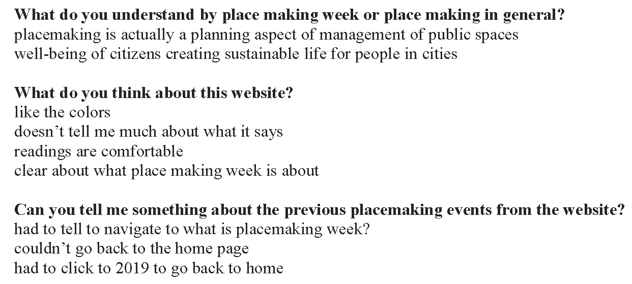
"[This is] too much text, I am not gonna read through all of this."
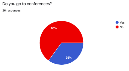
— Observation Study ParticipantWe focused on students as our primary user group — particularly interesting given that they represent only 5% of total attendees, yet are a key demographic for building long-term conference community. I consulted students from business, design, computer science, and architecture to capture a diverse range of needs.
We combined qualitative data from 15 in-person interviews and 10 usability tests with quantitative data from an online questionnaire to build a comprehensive picture of user needs.

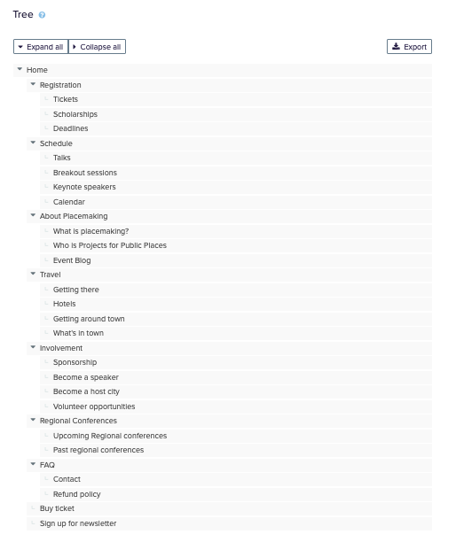
Preliminary research made it clear that fixing the IA was the single highest-priority intervention. Our high-level navigation goals were clear:
We defined 38 cards combining previous user input, terminology from the existing site, and language used by other well-known conferences. The card sort was conducted with 11 participants using Optimal Workshop.
The sort partially failed — we ended up with 61 unique categories. Rather than a setback, this revealed the depth of labelling confusion. Users weren't confused by the content; they were confused by the language used to describe it.
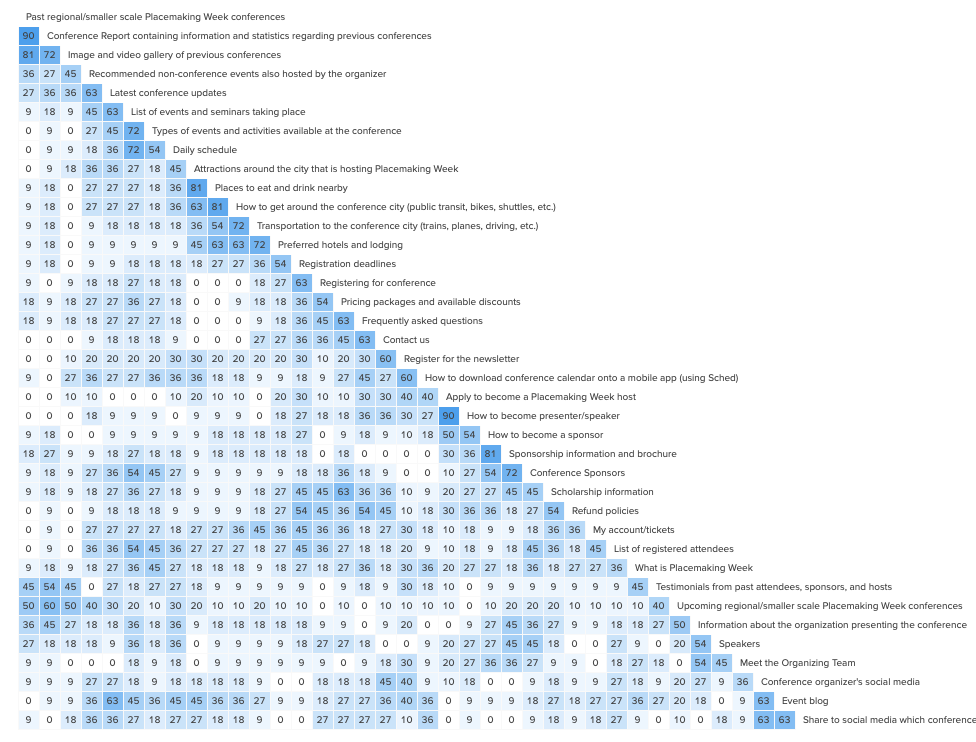
Taking card sort insights, we modified the labelling system and ran tree testing with 10 participants (5 in-person, 5 remote) using 7 short tasks designed to test navigation across key user journeys.
Every team member was responsible for sketching one section. I owned the header and footer — drawing two header iterations and three footer iterations. We then digitized paper prototypes and tested them remotely with 5 users (COVID forced the pivot from our in-person plan).
The visual redesign aimed to retain the organization's identity while updating components for better contrast and aesthetic appeal. The redesign uses the Open Sans typeface with a responsive 12-column grid system, and a color palette that inherits legacy while improving contrast ratios.
The client appreciated how the research-driven IA improvements translated directly into cleaner navigation and a more inviting first impression. We redesigned three pages for both desktop and mobile platforms.